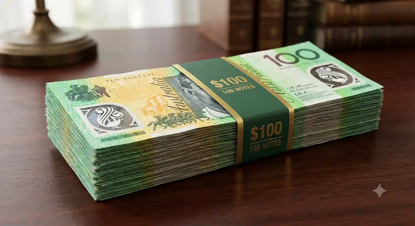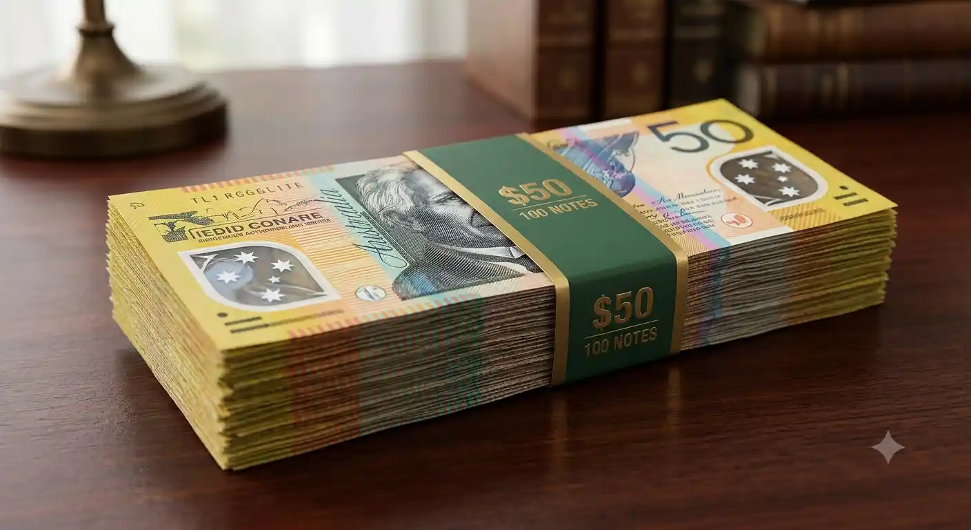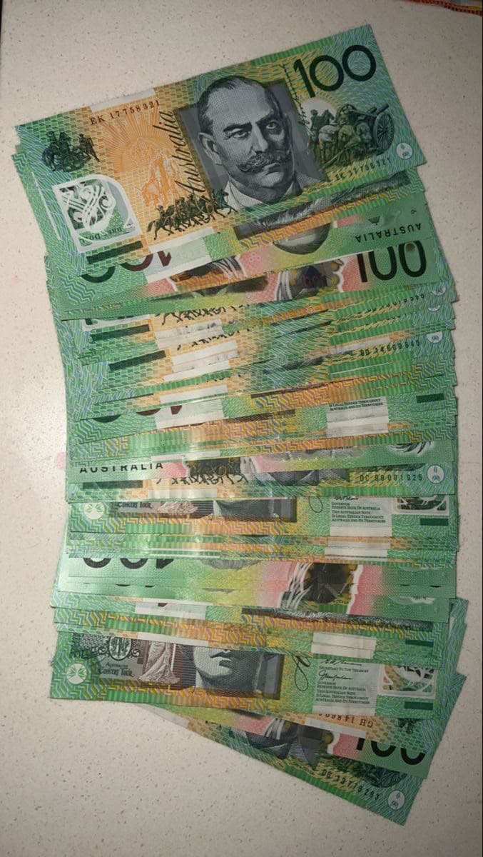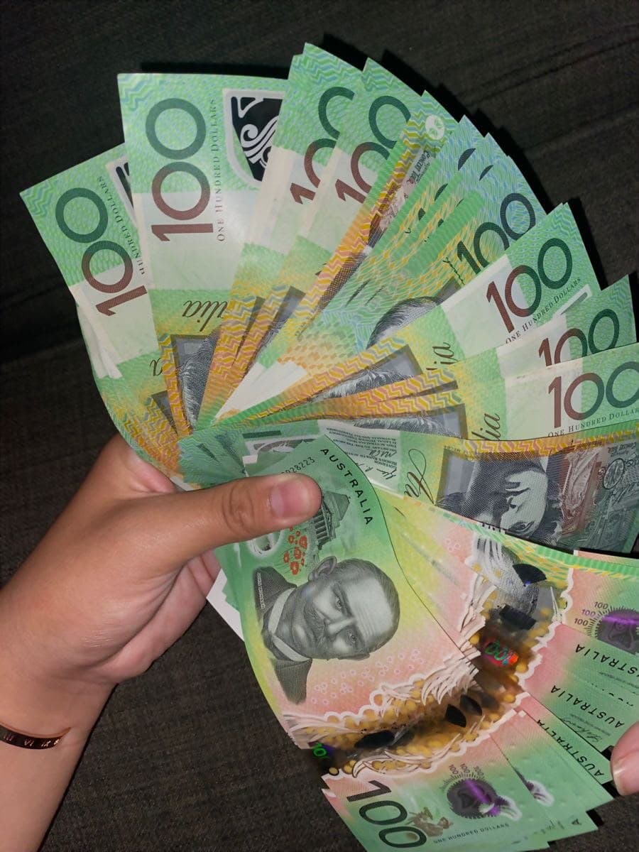
Cash is one of the hardest props to light. It is small, it is printed in fine detail, it is often handled by an actor in a close-up, and the paper reflects light in ways that a script supervisor will never notice but a lens always will. Realistic prop money can look flat, shiny or fake purely because of how it was lit, even when the notes themselves are excellent. This guide is written for directors of photography, gaffers and art departments. It covers what makes notes catch light, how to place the key and fill, how to test before the day, and the handling habits that keep a stack looking right across a long shoot. All PROPPS notes are specimen-marked, non-legal tender props.
The short answer
Use soft, large, angled light, keep reflections off the lens axis, test the exact notes under the exact lights at working distance, and choose matte paper so there is less glare to fight in the first place. If a note shows a hot spot in your test, change the angle of the light before you change the note.
Why prop money reads badly on camera
Three things go wrong most often.
- Specular glare. A glossy or lightly coated stock acts like a small mirror. A single hard source produces a bright patch that hides the print and flags the note as a prop.
- Flat, even lighting. A bank of diffused fill from the front removes the subtle shadows between notes in a stack. A stack then reads as a single block of paper rather than a bundle of notes.
- Wrong colour balance. Banknote inks are saturated. Mixed colour temperatures, for example a tungsten practical beside a daylight window, push the greens and golds in different directions and the cash stops matching the rest of the frame.
Realistic prop money starts with the paper. PROPPS notes are printed double-sided on 120gsm matte archival paper, which removes most specular glare before a light is switched on. That is a deliberate choice for the camera, and it is also why the notes are easy to tell apart from genuine polymer notes by touch.
Choosing the light
Soft and large
A large soft source close to the subject wraps around a stack and keeps highlights gentle. A softbox, a bounced source or a window with diffusion all work. A small hard source is the quickest way to create a hot spot.
Angle it off the lens axis
Reflections follow the angle of incidence. Place the key so that light striking the note bounces away from the camera, not into it. A useful starting point is to put the key at roughly 45 degrees to the table and to the side of the camera, then adjust while watching the monitor.
Use negative fill to keep the print dark where it should be
Banknote print is detailed. Too much fill lifts the shadows and flattens the engraving. A black flag or a dark card opposite the key restores depth and makes the stack read as three-dimensional.
Keep practicals honest
If a lamp in the frame is warm, match the key to it or gel the key. Cash looks wrong when the colour of the light on the notes does not match the colour of the light on the actor.
Close-ups, inserts and hero notes
A hero note for an insert needs more care than a stack in the background.
- Choose the cleanest, flattest note from the order and keep it separate from the working stock.
- Light it on a table first, with the camera at the planned lens height, before the actor's hand is in the shot.
- Check both sides, because many scenes flip or fan notes. PROPPS prints both sides to the same standard.
- Keep fingerprints off the surface. Oil from the skin picks up as shine under a low angle.
- Replace the hero note after a few takes. Handling softens the corners and the camera will see it.
Stacks, bundles and the money shot
A stack has to look like many notes, not one. Light from the side so the edges of the notes show as fine lines, and let a little shadow fall between bundles. For a vault or a table spread, treat the money as a texture: raking light shows the layers, while flat frontal light hides them. Our guide to how much prop money you need for a scene explains how many stacks the camera actually sees, which saves you lighting more than you need to.
Use hero stacks of $100 and $50 notes in the foreground, because their colours read strongly, and mix in smaller denominations for tills and wallets. The best Australian banknote denominations for film and TV guide shows how to choose.
A five-minute test before the shoot
Run this test on the day before, or at the start of the call.
- Set up the actual lights, flags and practicals for the scene.
- Place the notes where they will sit, at the planned height.
- Look through the lens or on the monitor at the planned distance for wide, medium and close.
- Tilt the stack slowly and watch for hot spots.
- Fan a note and flip it, as the actor will.
- Photograph it on the camera you will use and check the result on the monitor, not on a phone.
- Adjust the light, not the notes, until the print reads cleanly.
Lenses, cameras and sensor differences
A long lens compresses a stack and exaggerates the effect of a single reflection, while a wide lens shows more of the table and more of the light stand reflections. Shooting at a high resolution reveals paper grain and print detail that a lower resolution hides, so test at the delivery resolution. If you shoot on a camera with limited dynamic range, keep the highlights on the notes under control, because a clipped highlight on a white border cannot be recovered. A fast lens at a shallow depth of field softens background stacks, which lets you spend less on them.
Colour and exposure tips
- Expose for skin and let the notes fall where they fall. Cash that is brighter than the face pulls the eye away from the actor.
- Keep the notes within one stop of the surface they sit on, so they do not glow.
- If you are shooting a green or gold dominant frame, check that the note colours are not being absorbed into the background.
- Match colour temperature across the frame and avoid mixed sources on the cash.
- If you use a polariser, test it. A polariser can cut reflections, but it can also change the apparent saturation of the print.
Handling and continuity
Realistic prop money only keeps looking realistic if it is handled with care. Store the notes flat, dry and out of direct heat, because paper that has been in a hot car curls at the edges and catches light differently. Keep a spare stack sealed. Use gloves for hero notes. For repeated takes, rotate the stock so the same notes are not handled every time. For ageing and weathering, read our art department guide.
Compliance on set
Lighting a note so it looks real is part of the job, but the notes must stay clearly marked props. Every PROPPS note carries permanent specimen markings, is printed on paper rather than polymer and is sold as a non-legal tender reproduction for motion pictures, television, theatre, visual arts and simulation training. Never spend them or present them as real cash in publicity material. The Reserve Bank publishes guidance on banknote reproductions, and our Section 22 guide explains the standard.
Where to go next
See how the notes look in the New Notes range, compare the print quality in our guide to judging high quality prop money, or contact the studio with your lighting setup and we will help you choose.